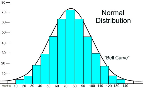
When learning about statistic measures of spread we fell on a very important subject as a class, standard deviation. A subset within standard deviation that I think is even more vitally important is normal distribution, or a bell curve. Having an understanding on this concept is vital to connecting knowledge of statistics to the world around you. For instance IQ is heavily based on how many standard deviation off the norm you stand. The average IQ score of 100 for example, represents a score in which 50 percent of the population scores higher than, and 50 percent scores lower than. Nature pretty accurately results in the bell curve as well. For instance a population has a wide array of outcomes in something such as eye sight, some members have perfect vision while others are left blind, but of course a majority lie somewhere in between.
A helpful hint as to the percent of a population within the subsets of a a given standard deviation is 68/95/99.7 , What these values represent is how much is included one standard deviation away in both directions (-1 to +1) is 68%, two standard deviations in either direction encompasses 95% ,etc. A place where knowledge like this is of tremendous value is commercial sales. You want to know where the average person in a society falls so you can effectively make products that appeals to a wide array of individuals. This is why a medium shirt flies off shelves and a XXL may sit for a while. It all due to statistics. Humans have a predictable way of behaving, and it seems like the normal distribution is the best way at representing this statistically.
A helpful hint as to the percent of a population within the subsets of a a given standard deviation is 68/95/99.7 , What these values represent is how much is included one standard deviation away in both directions (-1 to +1) is 68%, two standard deviations in either direction encompasses 95% ,etc. A place where knowledge like this is of tremendous value is commercial sales. You want to know where the average person in a society falls so you can effectively make products that appeals to a wide array of individuals. This is why a medium shirt flies off shelves and a XXL may sit for a while. It all due to statistics. Humans have a predictable way of behaving, and it seems like the normal distribution is the best way at representing this statistically.
Comments
Post a Comment